Data Visualization
All charts were generated using Plotly Express —
a high-level Python graphing library. Plotly Express functions use graph objects internally and return
a
plotly.graph_objects.Figure
instance, making interactive chart creation concise and expressive.
import pandas as pd
import plotly.express as px
data = pd.read_csv('insurance.csv')
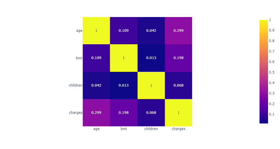
Correlation Heatmap — Showing the correlation between all numerical columns
using
px.imshow.
Values are rounded to 3 decimal places with text_auto=True.
fig = px.imshow(data.corr().round(3), text_auto=True)
fig.show()
Gender × Smoker Distribution — Count of female and male smokers/non-smokers,
grouped by sex with color encoding for smoking status.
px.histogram(data, x='sex', text_auto=True, color='smoker',
barmode='group', color_discrete_sequence=px.colors.qualitative.Vivid)

Charge Distribution — Frequency distribution of insurance charges across
all 1,338 records, highlighting the right-skewed nature of healthcare costs.
px.histogram(data, x='charges')

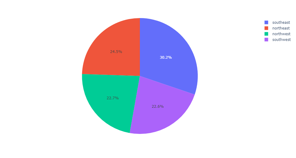
Charges by Region — Pie chart revealing that
southeast > northeast > northwest > southwest in total insurance charges.
px.pie(values=data['charges'], names=data['region'])
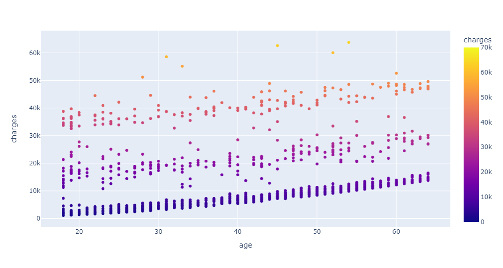
Age vs Charges Scatter — Reveals three distinct charge clusters,
likely corresponding to non-smokers, moderate smokers, and heavy smokers.
px.scatter(data, x="age", y="charges", color="charges", range_color=[0, 70000])